Thursday, 16 June 2011

Final 5

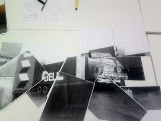
This is the Early design. I photocopied the original image zoomed in. Then i re-pieced them together to create a new image. I tried to keep the shape there so it can be identified as a truck.

I then brought it into the computer and cleaned it up. From here I applied the blending effects the same as the other designs. Using the soft light blending mode. I Duplicated the image three times and moved them about to create a transparent look. I adjusted the images to make the truck still visible and make the truck look longer, to try and visually represent time.


Using the cuttings from around the image, I put it on top of the image and cut off the square edges. The way i cropped it is done to follow the shape of the image. The way its positioned is to make the truck stand out. The main bulk of the truck is untouched by the background cuttings which makes it stand out as the dominant colour.

Final 4

This is the Early design. I photocopied the original image zoomed in. Then i re-pieced them together to create a new image. I tried to keep the shape there so it can be identified as a truck.

I then took a photo of the image and put it in photoshop. Like previous designs I applied the blending effect soft light. I then duplicated the image six times and moved them about. The purpose of this is to make the truck look extended to visually represent time.


With my design, I then used the background trimmings to create a abstract shape on it. I cut the trimmings shape to follow the shape of the image. When i applied one of the blending modes, this 'rusty' colour was created. I then applied it to the whole of this design because I think the 'rusty' colour is a could representation of age.
I really like the result of this final. The colour is helping to deliver the message about time. The layout is my favourite because the duplicated image connects and flows much better than the others.
However, the background it does not work with the image. The grey is too dominant with this image which has lots of transparency. 

Final 3

This is the Early design. I photocopied the original image zoomed in. Then i re-pieced them together to create a new image. I tried to keep the shape there so it can be identified as a truck. In my opinion this design does not work because it is missing too much detail. 


I then applied the blending tool, soft light like my previous designs. I then duplicated the image three times and moved them about. I adjusted them to make the image look extended as a visual to represent time. It has a bronze look to the design which could be a good indication of its age. Bronze being the oldest(bronze age comparison). Using the background trimmings from the image I created a abstract shape around the image. The I cut it to make it follow the image shape.


I then applied type which highlights the main information I want the poster to say. I resized different parts of the type depending on the importance of the message. The date being the biggest, so its visible and creates consistency with my other posters. 
I feel that this design successful due to it not being consistent with the other posters. I feel the colour and shape of the trimmings are not consistent with the other posters and take away from the truck.

Final 2


For this design, I used a photo of one of the designs collages i made. Then I used the blending tool, soft light again and duplicated the image three times. I left one of the duplicates on top creating a bulk of the image to appear darker. This helps the viewer locate the focus of the image. Then using the trimmings, I applied the divide tool and began to cut it further to follow the shape of the image.


I then changed the effect to soft light, which made the image blend and appear more effective.


I added the type to help with the narrative. I gave it the important information I feel it needs in my series of posters. However, the layout of the type is poor. The type is too centralised since the image as a whole is much larger. The typeface used too thick and bold. It has made it the focus of the image. The white on black also makes it draw attention.

I moved the type out of the centre of the image and have it a more appropriate location. I also changed the colour grey which makes the colour in the image more consistent. I enlarged parts of the type to show which parts are more important.
I also tried a different approach. Blending text with the image and repeating words to try to be more creative with my type. This is unsuccessful. The type is too large and draws too much attention to itself. Repeating it is also a pointless effect.

More type experimentation. I tried using some transparent type to be more consistent with the image and using bold black for more important words.
This has been a unsuccessful experiment because the type is still drawing too much attention to itself and taking away from the image. To improve this, the type needs to be more small and transparent.


For the final, I decreased the scale of the type and made the colour grey which is more consistent with the image. I also spread the type out a little to stop it all being bulked together. The type also varies in size depending on the importance of the message. 

Final Outcome Layout Mockups

For my show. I had considered putting it above on the roof. The tunnel area being so secluded, its like a timeline, so when viewing my posters, it will be like walking down a timeline. I has also considered positioning them so that the further you go, the more the image rotates and will end on the roof.
However, after analysing the area. I come to the conclusion that there is not enough head room for the posters and will cause problems.


Another layout would be the posters spread across both walls. Right at the back would be the oldest of the generations. After reviewing the idea, I concluded that it may be hard to read the direction of the timeline.


Another layout would be lying flat on the roof. But i will not use this idea as people might not even realise its there. it also would mean people would have to look up while walking up the entrance.

Areas considered for the Show

I had considered hanging my posters here from the roof in a accordion format. 

I had also considered hanging them here from the roof. Going forward through the roof like a timeline.

Another format would have been to put them vertically going down. I think it would have been appropriate here because of the glass window being transparent like the effects on my design.


I had considered hanging my posters here from the roof in a accordion format, then below in the glass case could have been my zine.

I have chosen the tunnel as my location for my posters. The reason being, its a secluded area of the feed studio which you can walk down. This makes it perfect for my designs as the viewer will be able to interact with my work by walking through the tunnel which is almost like walking down a timeline.

Wednesday, 11 May 2011

Photo Update

Its took ages, but after many emails and phone calls Ive got my hands on more photos, but out of all of them, one in paticular is especially valuble to this project. One of the first trucks ever used in the family business(originally he was using horse and cart). With this, I have a picture for all 5 generations.

 Orginal truck.  I was told that his first trucks he had, he purchaced off the British army after one of the world wars. I will get more on this and a quote if possable.
 More of Roydene. Last Generation

More of Current Generation, COLKAR. Many of these sent to me by my uncle seemed to have been used in the magazine pages i scanned in towards the begining of the project.


Monday, 9 May 2011

First Poster Development

After bring my poster into the pc, I added some newspaper cutout for type and some pc rendered type. Which i think conflicts with each other. I will have to remove one to make the design work. I also think the photo needs to have a more graphic element to it.

So, I tried out a new background colour and applied the soft light blending mode.
I then duplicated the image and moved them about so that I could get a multiple exposure look. 

I then changed the background again to a more appropriate colour for a black and white image.

I then duplicated the image again, and made it so it looks like the truck has become extended. The reason for this is to show it is moving with time. 
I also took the cropped background and started apply blending effects to them. It started to create some transparency effects.
I then cropped the background, following the shape of the image and created a abstract shape. The result of this has created a poster which I feel has a good narrative, well contextualized and meets the brief.

I also tried out some more backgrounds. This one was the one that worked best, however it has no relevance to my chosen theme and so is not appropriate for my design.

Type Experiments


Photo Collages

Taking a step back, I decided to start photocopying my image and re-piecing it toegther to create a new image in the style of David Hockney. I mainly tried to keep the truck identifiable while creating a new perspective of the truck.

 I dislike these designs because the paper I used to make them are all on different angles. I need to keep the paper straight in future designs.