
Wednesday, 30 March 2011
Paintings and Illustrations


Images from 'Artists & Illustrators' Magazine
This image is showing different perspectives or expression of this man. For the painting, it looks as if the paint has been put on quite thick to give it that texture and make it feel more real. It almost looks 3D.
This image is showing different perspectives or expression of this man. For the painting, it looks as if the paint has been put on quite thick to give it that texture and make it feel more real. It almost looks 3D.


Neville Brody Research

The design does not work in my opinion. I personally don't understand the message and feel the use of type is not bringing out the message.


All Sourced from Neville Brodys book "THE GRAPHIC LANGUAGE OF NEVILLE BRODY"


Tuesday, 29 March 2011
Logo Design - Mother and Father

(from left to right) Original, Inverted, greyscale, Transparency lowered.

For my Final logo, I vectored idea 10. I feel this logo was successful because it has a good narrative, looks proffessional and uses only one colour. It was also influenced by anothers work and can be scaled down without loosing too much detail.
Idea 5 Vectored. This logo fails to deliver the narrative and does not look like a truck. It looks very childish and does not suit a logistics company.
Idea 7 vectored. For this logo, I experimented with different colours and shapes.
I don't like this logo because it looks unproffessional and does not deliver the narrative well.
Vector version of idea 1.
I did not like this design because it looks very amuture and did not work as a logo. It fails to show any noticble narrative and is not very eye catching.


Idea 1: Was a tree made of the initials of Mother and Father.
Idea 2: To create a Truck wheel out of the initals
Idea 3: Front and side of a truck
Idea 4: A moutain make of the initals
Idea 5: A truck made of initals
Idea 6: Tunnels made out of initals
Idea 7: A safety Helmet made out of Initials
Idea 8: A Clover made out of initals
Idea 9: Simular of the COLKAR Logo, but made of Initials
Idea 10(Final): A Warehouse made with Initials
Monday, 28 March 2011


General Infographics Research


Recreations of the pie chart.

This infographics has a good colour chart which indicate different levels of marketing. The layout is good and the pie chart is centre making it the focus of the image.


Logo Research

This logo has a strong narrative. The apple has been used for the word gravity because of the way gravity was discovered. Issac Newtron discovered gravity when a apple fell and hit him on the head.
It uses only one colour and has very little detail making it possable to reduce the size without ruining the logo.
Uses W.O.B(white on black), which is good because it can be inverted and greyscaled easily.


In my opinion this logo is a good pun, and works as a identity. However I feel that the logo would loose too much detail if shrunken any further.

The Wineforest logos narrative is strong. While at first glance it looks like a forest, the logo has been designed so that we can see wine bottles too. This visually shows the name of the company "wine forest"
In my opinion, this logo is a good illusion which delivers the message even without the name below. I think the colour is appropriate since forests are often associated with brown. Also, age is important to wine, and the trees can be associated with age because of the roots.
Parent Definition
A parent is a caretaker of the offspring in their own species. In humans,
a parent is the mother or the father figure of a child
A father or mother; one who begets or one who gives birth to or nurtures and raises a child; a relative who plays the role of guardian
Rear: bring up; "raise a family"; "bring up children"
An organism (plant or animal) from which younger ones are obtained
The next level of classes above a specific class in the inheritance hierarchy. Those from which a class directly inherits.
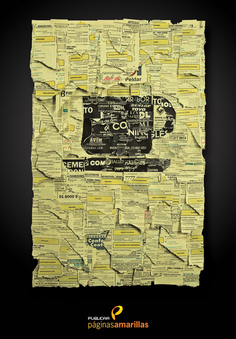
COLKAR in Magazine


Subscribe to:
Comments (Atom)