Wednesday 11 May 2011

Photo Update

Its took ages, but after many emails and phone calls Ive got my hands on more photos, but out of all of them, one in paticular is especially valuble to this project. One of the first trucks ever used in the family business(originally he was using horse and cart). With this, I have a picture for all 5 generations.

 Orginal truck.  I was told that his first trucks he had, he purchaced off the British army after one of the world wars. I will get more on this and a quote if possable.
 More of Roydene. Last Generation

More of Current Generation, COLKAR. Many of these sent to me by my uncle seemed to have been used in the magazine pages i scanned in towards the begining of the project.


Monday 9 May 2011

First Poster Development

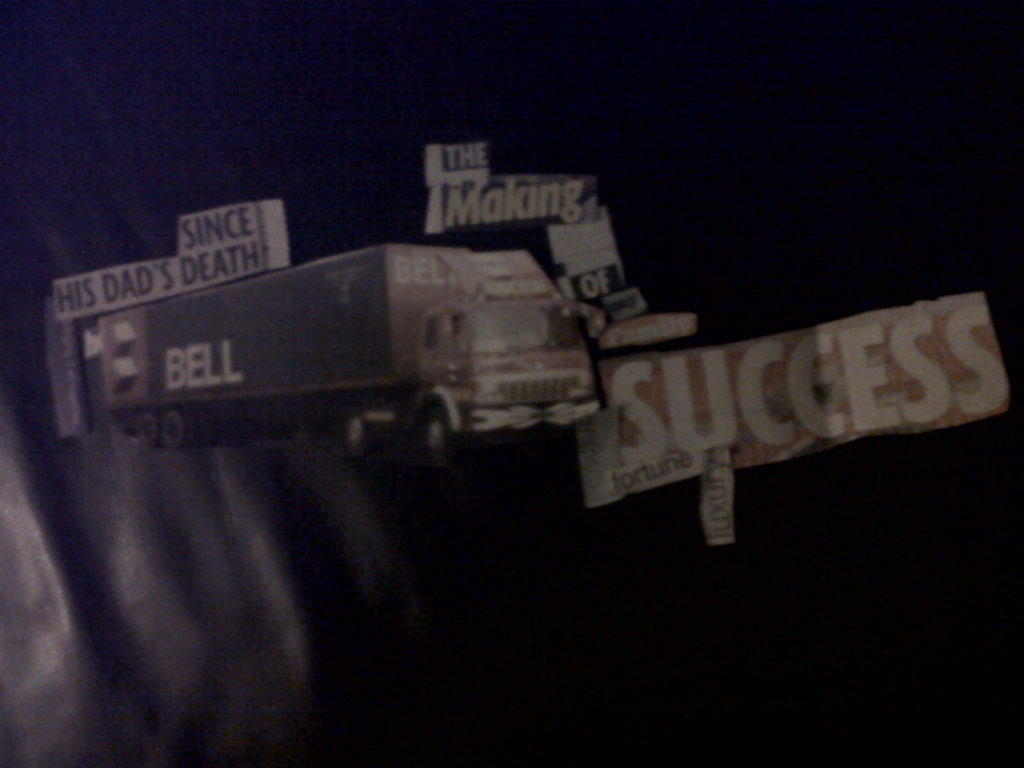
After bring my poster into the pc, I added some newspaper cutout for type and some pc rendered type. Which i think conflicts with each other. I will have to remove one to make the design work. I also think the photo needs to have a more graphic element to it.

So, I tried out a new background colour and applied the soft light blending mode.
I then duplicated the image and moved them about so that I could get a multiple exposure look. 

I then changed the background again to a more appropriate colour for a black and white image.

I then duplicated the image again, and made it so it looks like the truck has become extended. The reason for this is to show it is moving with time. 
I also took the cropped background and started apply blending effects to them. It started to create some transparency effects.
I then cropped the background, following the shape of the image and created a abstract shape. The result of this has created a poster which I feel has a good narrative, well contextualized and meets the brief.

I also tried out some more backgrounds. This one was the one that worked best, however it has no relevance to my chosen theme and so is not appropriate for my design.

Type Experiments


Photo Collages

Taking a step back, I decided to start photocopying my image and re-piecing it toegther to create a new image in the style of David Hockney. I mainly tried to keep the truck identifiable while creating a new perspective of the truck.

 I dislike these designs because the paper I used to make them are all on different angles. I need to keep the paper straight in future designs.


David Hockney

Image has been taken at different perspectives and then put together to create a abstract image of a chair. The design does not recreate the chair exactly with every detail but rather creates a abstract perspective and even repeats areas of the chair.
For me, this image is a successful photo collage which has radically changed a ordinary photo perspective of a chair. The layout has also been successful in creating a abstract frame to the image.
This image has been taken from different perspectives then pieced together to re-construct the image. The design reminds me of cubist art and is a successful example of photo collages.
This design has changed the perspective of what a ordinary photo of this road would have been. The buildings and the grass have different colours and shapes pieced together through this photo collage. It also reminds me of google maps street view.


This image has been taken from different perspectives and put together to create a new image. This design captures the emotions and movement of the family playing scrabble. 
This is my favorite of David Hockney's work because of the way it captures the emotion of the people and tells a story. The shape of the design also abstract and not a ordinary boxed off image. His work has had a influence on me and I will adapt his style into my work.

Tuesday 3 May 2011

Update 3

I am giving up on this idea. I developed it this far to see if it would work, however it has failed. I gave up on it because it lacks contexual influences, narrative and as a visual isn't very exciting. It was put togther randomly with no thoughts gone into why I used the materials i used, or why I used the materials on the specific area of the truck. The way the materials were applied, was very ametur and rough. 
Overtime, it has lost its original purpose being based around the theme of parents. It rather became about one truck.  
Rather than dumping the concept completely, I am going to take a step back and look into some typography and photography artists. Then re-approach the idea but with more contexual influences.

Update 2

In this update, I started creating the layout like the Toyota adverts. Adding my development around the truck and other various bits.
I completed the front of the truck and started for the trailer. I made it from tinfoil because it can be shaped the way you want. This way I can create the texture a truck would have.